picturecredit: http://www.sullivanconard.com/
Having parents who are not only attracted to outstanding art but also having a great sense for architecture and interior design had ultimately a major influence on me.
Since I discovered the variety of architecture blogs, I always admired some specific ones that offer me a daily dose of amazing inspiration in that sector. As I’m not calling myself an expert (in contrast to what I call my parents), I can’t tell much about the facts that attract me the most in terms of specific houses, buildings or interior. But something I can certainly say: I love puristic design. Straight lines, symmetry and that special something, which engages the person to a cool but welcoming atmosphere are the ultimate factors that always make crave to live in such an environment all by myself one day. That’s why I’m an obsessive collector of pictures of this world’s (personally considered) most amazing houses and that’s why I found that it’s time to share some of the over 1000 images with my readership. To start off with my newest label “Architecture” (for some other impressions, click on the sidebar and discover which amazing places I was able to visit and other stuff that perfectly matches this label), I thought about sharing The Washington Park Residence.
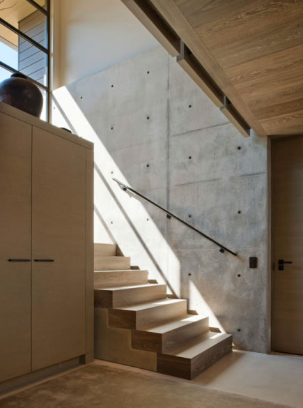
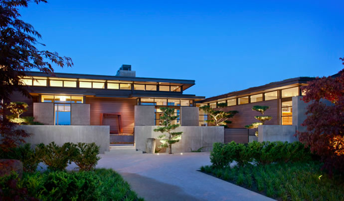
Being a project by the Sullivan Conard Architects, this house is located in Seattle near Lake Washington and Cascades. The elements of rare stone and nature orientated elements and colours build a beautiful balance to the clean and structured shape. The picture that attracted my at first (and mostly!) was the one presenting the entrance with the sunlight flooding the room and offering an incredible sight. Thanks to the broad windows, the house holds a link to the surrounding nature and meanwhile maintains privacy. The way the light can flush into each corner if you want to but doesn’t necessarily has to, is something I absolutely adore. As a contrast to the raw stone and wooden elements, the steel walls add that cool atmosphere and show some major awareness of modernity without exaggerating.
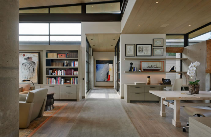
However, there is one decisive thing that didn’t convince me, thus makes the whole appearance a little harder to look good for those of us having not such an architectural affinity. It’s the interior. Although I like furniture, which perfectly fits to the palish nature tones, I personally don’t like the various pictures hanging nearly everywhere. It takes some essential room.


Not convinced of the table + the art

Again, too much of the art standing and hanging around.


